CV Creator » CV advice »
CV layout and formatting
Your CV layout is the “reading experience”: how quickly a recruiter can scan your application, and how cleanly an ATS can read it.
Not what you meant? If you’re looking for the best CV format (chronological vs skills-based vs combination) and which one fits your situation, see: CV format.
Choose your layout: single vs two-column vs infographic
Your layout choice affects both ATS compatibility and human readability. Use this as a practical rule:
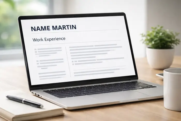
Single-column CV layout
- ATS risk: Low
- Best for: job boards, online forms, corporate applications, high ATS usage
- Why it works: predictable top-to-bottom reading order; easy scanning
Recommended for most UK applications
Two-column / sidebar layout
- ATS risk: Medium (depends on the system and how the template is built)
- Best for: direct emailing to a recruiter, portfolio-friendly roles, when you keep the main content clearly structured
- Safe approach: keep Work experience and Education in the main column; use the sidebar for contact details, skills, or tools.
Use carefully
Infographic / heavy design layout
- ATS risk: High
- Why to avoid: charts, icons-as-labels, text inside shapes, and unusual reading order can hide key details from ATS.
Avoid for most applications
Quick tip: If you’re unsure how the employer collects applications, assume ATS and use a single-column layout.
Fonts, sizes and heading hierarchy
Choose a readable font (and stick to it)
- Use one clean font across the CV (two max: one for headings, one for body).
- Avoid decorative fonts. The goal is speed-reading.
- Make sure it looks good on mobile (many recruiters skim on phones).
Use a simple size scale
- Your name: the largest element (easy to find instantly).
- Section headings: clearly bigger than body text.
- Body text: readable and consistent (avoid tiny text to “fit more in”).
Heading hierarchy (consistency is the whole trick)
- All section headings should look identical (same size, weight, spacing).
- Job titles should look identical across roles; same for degree titles.
- Use bold sparingly: highlight what matters (job title, company, key results).
Spacing, margins and alignment
White space makes your CV feel “senior”
- Don’t cram content edge-to-edge. A CV should breathe.
- Use consistent spacing between sections (not random extra blank lines).
Bullet points: keep them tight
- Use one bullet style throughout.
- Keep indentation consistent (misaligned bullets look messy fast).
- Aim for 1–2 lines per bullet when possible.
Dates and alignment: pick one system
- Use one date format everywhere (e.g. Jun 2023 – Nov 2025).
- Keep date placement consistent (all right-aligned or all inline under the job title).
- Ensure company/location formatting is consistent across entries.

ATS-friendly layout rules (safe mode)
If you’re applying through a portal, keep the layout simple so software can read it correctly.
Do (ATS friendly)
- Use standard headings: Work experience, Education, Skills.
- Keep content in real text (not images of text).
- Use simple bullets and clear section breaks.
- Put the important info in the main content flow (top-to-bottom).
Avoid (common parsing issues)
- Tables, text boxes, and complex shapes
- Icons used instead of text labels (ATS may ignore icons)
- Charts/skill bars/infographics
- Overly complex two-column reading order
Want a designed CV without breaking ATS? Choose a template that uses light visual accents (colour lines, subtle dividers), but keeps headings, bullets and core sections as plain text.
CV length in the UK: 1 or 2 pages?
Rule of thumb
- 1 page: students, graduates, early-career candidates (or when experience is limited).
- Up to 2 pages: most experienced candidates with relevant achievements.
How to shorten your CV without deleting value
- Cut “responsible for…” duties and keep outcomes/impact.
- Reduce old roles to 1–2 bullets (or remove if irrelevant).
- Trim long summaries: keep them sharp and specific.
- Use tighter bullets (remove filler words, keep numbers/results).
Need help deciding what to keep vs cut? See: How to write a CV.
PDF vs Word + sending by email
PDF vs Word: what should you send?
- PDF (recommended by default): preserves layout exactly as designed.
- Word / .docx: keep a Word version ready if an employer specifically requests it.
File name (small detail, strong signal)
Use a clean filename:
- Firstname-Lastname-CV.pdf
- Or: Firstname-Lastname-JobTitle-CV.pdf
Sending your CV by email (quick checklist)
- Attach your CV as a PDF (unless asked for Word).
- Double-check your contact details and links (LinkedIn/portfolio).
- Open the PDF on mobile to confirm nothing shifts.
- Keep the email simple and professional (clear subject line + short message).
Key takeaways: CV layout and formatting
A strong CV layout makes your application easier to read and harder to dismiss. Here are the key formatting rules to keep your CV clean, professional, and ATS-friendly.
- Use a single-column CV layout when applying through job boards or portals — it’s the safest choice for ATS.
- Consistency makes your CV look professional: one heading style, one bullet style, one date format, clean alignment.
- Readable typography wins: keep fonts simple, sizes clear, and headings easy to spot at a glance.
- White space is a feature, not wasted space — it improves scanning and reduces “wall of text”.
- Keep it 1–2 pages: one page early-career, up to two pages if your experience is strong and relevant.
- Send as PDF by default to preserve formatting (use Word only when an employer asks for .docx).
- Before you send, open the PDF on mobile and check links, spacing, and that nothing shifts.
FAQ about CV layout and formatting
What is the best CV layout in the UK?
Are two-column CV layouts ATS-friendly?
What font and font size should I use on a CV?
Should I send my CV as PDF or Word?
How long should a CV be in the UK: one page or two?
How can I make my CV look more professional instantly?

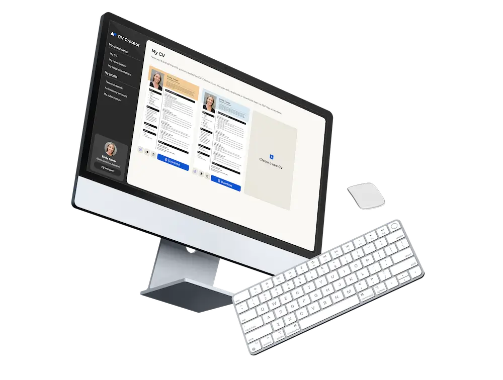
Build your CV with a layout recruiters can scan in seconds
A clean, consistent CV layout makes your application look more professional — and helps recruiters find your strongest points fast.
Got it – create my CV